Pitch f/x for Dummies
Since nobody cares about anything I post that isn’t raw, hard, data, I should probably explain once and for all what these charts I pump out really mean and then just link to this post for newcomers to the pitch f/x world. I used to gush on and on about system, but these days can’t even bring myself to mention that they’re from the catcher’s perspective before launching into a dizzying sequence…
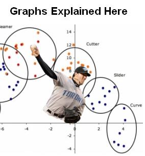
First, what is to me the most interesting and useful data- pitch movement. Using my favorite graph from a splendid Shaun Marcum outing, here’s the complete catalog of pitches (except the splitter which is almost indistinguishable from a changeup but thrown harder) and what they look like:

As you can tell from superimposed Marcum, we’re looking at the pitch from the hitter’s perspective from whichever side he throws from. A 4-seam fastball is as “straight” a pitch as there is, and then breaking balls go one way and sinkers and changeups tail the other. The scale is in inches.
This does understate the knee-buckling quality of a curve or any other offspeed stuff, because they go up and then come back down more than a hard cutting pitch but don’t necessarily end up anywhere different than a hard cutting pitch. Pitch f/x does also measures this “break”, I just never use it because I like movement as a quick way of seeing what is working for a pitcher on a given night. Contrary to popular belief, there are no “late breaking” pitches- once the ball leaves the pitchers hand, it acccelerates at a constant rate. Anything else is an optical illusion (like a “rising fastball).
Now for pitch location:

Pretty self-explanatory…The average strike zone in the majors is from 1.6 feet at the knees to 3.5 at the letters. Pitch f/x records the top and bottom of the strike zone for every batter, and I adjust every pitch based on it. So if a pitch catches the top inside corner of the zone for a monster like Frank Thomas, it will appear in the same place as that for David Eckstein.
The sides of the plate are a little tricky. First (and the graphic you see on TV doesn’t seem to be aware of this) you have to add an inch and a half to the zone because the system measures the dead center of the ball, and if any part of it goes over the plate then it’s a strike. Second, major league umpires on average give another 2 inches or so (more for lefties, less for righties) off the edge of the plate, and don’t give calls on the corners as much as they do pitches at the belt. But the yellow outline is the technical strike zone.


Less pitch f/x, more heartwarming stories.
Archimedies
May 17, 2008 at 11:00 pm
If you look really close, Shaun Marcum is rescuing an orphan puppy from a burning building in that picture. And the pink bat…
halejon
May 17, 2008 at 11:49 pm
[…] change was flat as a pancake (and quickly discarded) and his curve was more of a slider. (See here for how to read this […]
Understated Docly « The Mockingbird
May 24, 2008 at 4:03 am
Balls don’t normally accelerate after they leave the pitchers hand. They usually decelerate unless the pitcher is playing in tornado conditions.
Because pitchers are not throwing the ball in a vacuum, the also don’t decelerate at a constant rate. The friction of air is dependent on the velocity of the ball as well as it’s spin. Thus a fast moving ball is generally decelerating faster than a slower moving ball.
Finally, because of chaotic turbulent air flows, it is definitely possible that a late break effect is real. That’s a little difficult to describe succinctly but if you stick your hand out of the window while you’re driving, you can see that wind resistance is non-linear depending on the angle of your hand. And at different speeds, the effective dynamics is different. Thus as a ball decelerates towards the plate, it is possible that the spin effect dominates only as it nears the plate when it is traveling somewhat slower.
melvin
May 30, 2008 at 2:20 pm
Sure they do – when you’re dealing with vectors of a breaking pitch they accelerate in a sideways and downwards. Their overall velocity will never increase, but that’s not what I was referring to.
It’s possible, but not to the extent that people describe it. The acceleration of a pitched ball is VERY close to being constant, any difference between a 85 and 95 mph fastball is negligible. It’s just that all the movement happens towards the end so that is perceived as it starting to move late. There’s no way to throw a better breaking pitch at the same speed that will go straight and then suddenly fall of a table as is constantly suggested.
halejon
May 30, 2008 at 3:10 pm
[…] Down and In and Gone Posted in Seriousness by halejon on June 20th, 2008 I’ve been curled on the floor in hysterics most of today, but here’s a belated look at A.J. Burnett solidifying his case to be the Jays’ fifth starter: (If this is Greek to you, click here). […]
Down and In and Gone « The Mockingbird
June 20, 2008 at 8:28 pm
[…] A tip of the hat to Ari, who cast some doubt on the ump’s strike zone today. Here’s are the calls that Baltimore pitchers were getting from the home plate ump Jim Joyce over the game (to learn how to decode these charts, click here): […]
Wonderfully Strange « The Mockingbird
July 23, 2008 at 4:21 am
[…] I haven’t done one lately, so here’s a gratuitous pitch f/x look at Brandon League’s one inning tonight. I noticed something that seemed new- some of his pitches had his usual ridiculous sink, while others were more flat (and controllable?). Sure enough, it looks like two distinct pitches about 4 inches of sink apart, but with the exact same velocity (graph explanation here). […]
Last Minute Rewrite « The Mockingbird
July 26, 2008 at 1:39 am
[…] Where he really got burned was…all together now…down and in. Where every pitcher always gets burned (ok, Pena’s a lefty to that was actually a pretty decent back-door slider but still…) Now here’s the pitches he was throwing (for an explanation of the movement graph, go here). […]
Scott Richmond Rundown « The Mockingbird
July 31, 2008 at 12:52 pm
What’s wrong with these comments?
halejon
August 26, 2008 at 6:30 pm
[…] cutter that put him on the DL in the first place. Gone are the days when he was throwing such an even assortment of pitches every start that he’s the sample of what a perfect pitch rainbow lo… – now he’s bringing a different selection every […]
Marcum is the New Cutterballer « The Mockingbird
September 11, 2008 at 11:49 pm
[…] https://bjays.wordpress.com/2008/05/17/pitch-fx-for-dummies/ […]
Explaining Pitch f/x Movement Through James Shields
July 16, 2009 at 10:07 pm
[…] https://bjays.wordpress.com/2008/05/17/pitch-fx-for-dummies/ […]
Explaining Pitch f/x Movement Through James Shields | The Rays Party
October 15, 2009 at 6:37 pm
[…] them:Compare this chart to one that John Hale made on The Mockingbird to describe, as he puts it, a “splendid” outing from Shaun Marcum a year ago. Comparing Drabek to Marcum is interesting because where Drabek has a harder fastball, […]
Linkin’ Ballpark: The Kyle Drabek Record Edition | Blog Archive | Getting Blanked | Blogs | TheScore.com
June 2, 2011 at 9:25 am
From a PITCHf/x relative-newbie, some questions and observations:
First, thanks for your excellent website and hard work.
(1) Can we assume that the Home Plate figure in the 2nd graph – although carefully centered at zero in the Horizontal – is NOT to scale horizontally and is just there as a reminder? Since only the “white” defines the Strike Zone width and is 17 inches wide in the Rule Book, this figure seems not wide enough in the “white”.
Nor does the “yellow outline” look wide enough (see (4) below).
(2) Although the units (feet) are the same on both Horizontal and Vertical axes in the 2nd graph, why are the axes physically scaled differently? It seems that one foot measured Horizontally is graphically longer than one Vertical foot.
(3) ” … you have to add an inch and a half to the zone because the system measures the dead center of the ball … “.
Agreed you have to add something. But since the nominal diameter of a baseball is just slightly under 3 inches, I assume you are talking here about adding one-half its diameter (i.e., its radius) to each side edge of the “white”. But shouldn’t we be adding a full ball-diameter to each edge, since – by the Rule Book – even if one thread of one stitch of one seam intersects the Zone, the pitch qualifies as a Strike? And of course this should apply to the Upper and Lower limits as well …
(4) Can you elaborate on the Frank Thomas / David Eckstein normalization process?
Thanks again,
EdF
EdF
August 22, 2011 at 6:34 pm
That should read ” … see (3) below … ”
EdF
EdF
August 22, 2011 at 6:38 pm
Weird…I responded and it never showed up. Quickly: 1) is a mistake – I never knew that about the black. 2) is a squashed graphic, it should be the same scale both ways. My Bad. 3) Nope – since the system measures from the middle of the ball, a full ball would be too much. 4) That’s just something I did in my graphs since otherwise drawing an average strike zone over a full game with different hitters made it look like the ump was blowing calls. I remapped each pitch based on where it was for a given batter’s strike zone onto the average strike zone for the league.
halejon
September 3, 2011 at 6:31 pm
actually the black of the plate, is part of the plate too and is considered a strike
oz007
September 3, 2011 at 6:18 pm
[…] just might see a change in Morrow’s offerings. The first chart below displays the breaks. Use this invaluable chart from former (?) Jays blogger Jonathan Hale to better understand what you see […]
Straight From the Horse’s Mouth | Getting Blanked | Blogs | theScore.com
September 19, 2011 at 2:03 pm